Ornamental Lettering That Looks Carved, Not Typed
The gap between "nice handwriting" and lettering that looks engraved is a handful of rules. Here they are.
Maya Okafor
Contributing Artist ·
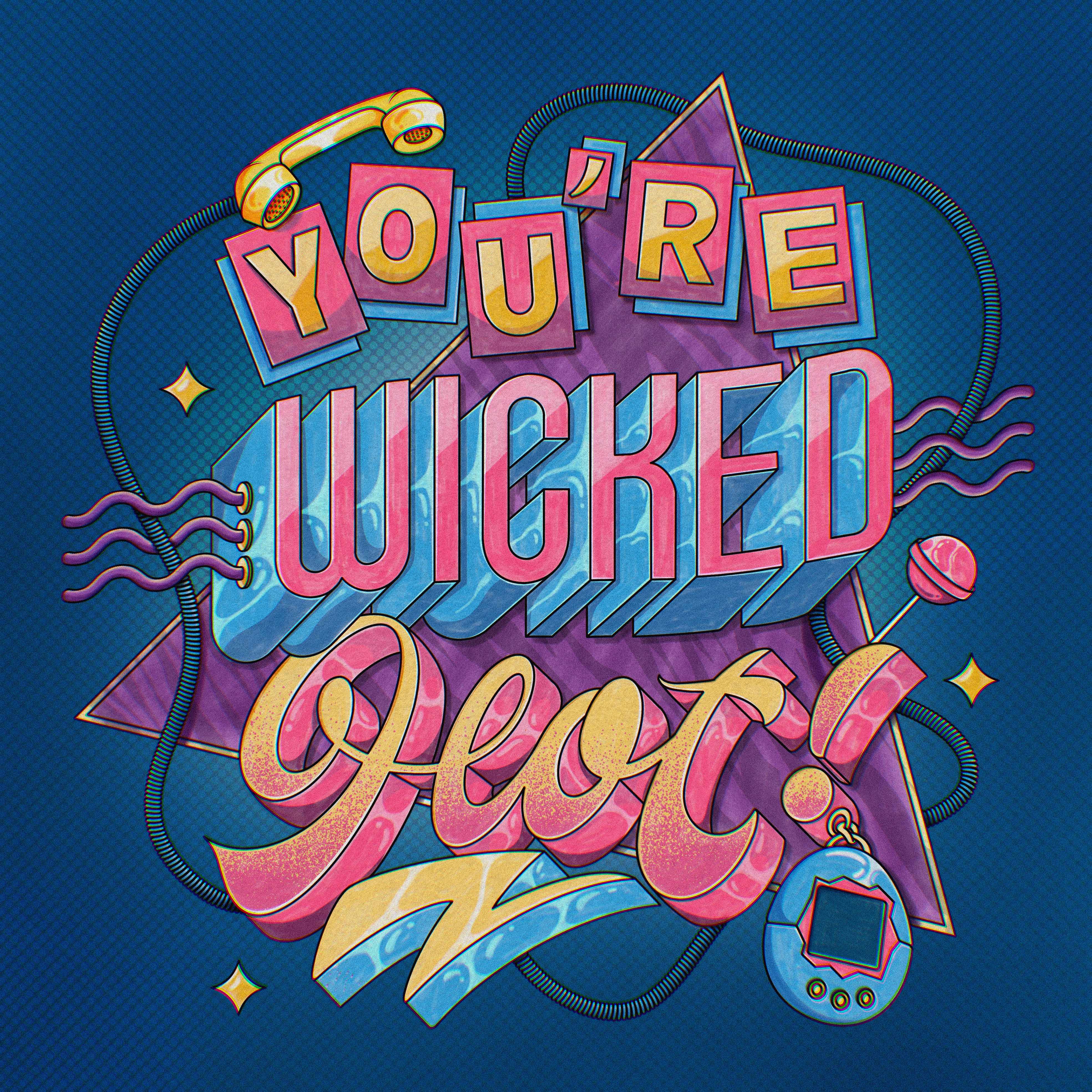
Beautiful lettering rarely comes from a steadier hand. It comes from a few decisions about weight and rhythm that you can copy on purpose.
Thick down, thin up
The single rule that makes script look professional is this: press on downstrokes, lift on upstrokes. Your brush gets fat coming down and thin going up. That contrast is what your eye reads as "expensive."
- Build the skeleton first in a thin monoline, then add weight in a second pass.
- Keep the spacing between letters more even than the letters themselves. Rhythm over perfection.
- Flourishes should follow the direction a stroke was already going, never fight it.
Jimbo (@shoutbam) builds an entire ornamental Art Nouveau letter from scratch at the Two Tap Summit, flourishes and retro type tricks and all. If lettering is your thing, block that session out.
Good lettering is not neat. It is rhythmic.Maya Okafor
Liked this? The next one lands in your inbox.
Join the free Collective Dispatch. One focused email every other Tuesday.