The Magazine
Craft7 min read
Why Your Colors Look Muddy (and the Fix Nobody Mentions)
It is almost never the palette. It is temperature and value. Two ideas that fix ninety percent of muddy digital painting.
KU
Kai Underwood
Craft Editor ·
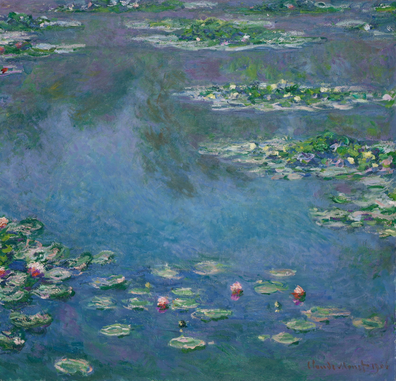
You pick colors you like, you blend them, and the result turns the color of a rain puddle. It happens to everyone, and it is not a taste problem.
Mud is a value problem wearing a color costume
Convert your piece to grayscale. If the values are a narrow gray soup, no amount of hue-tweaking will save it. Widen the range with real darks and real lights, and the color snaps back to life.
Then let temperature do the mood
- Warm light almost always means cool shadow, and the reverse. Keep them apart and the form reads.
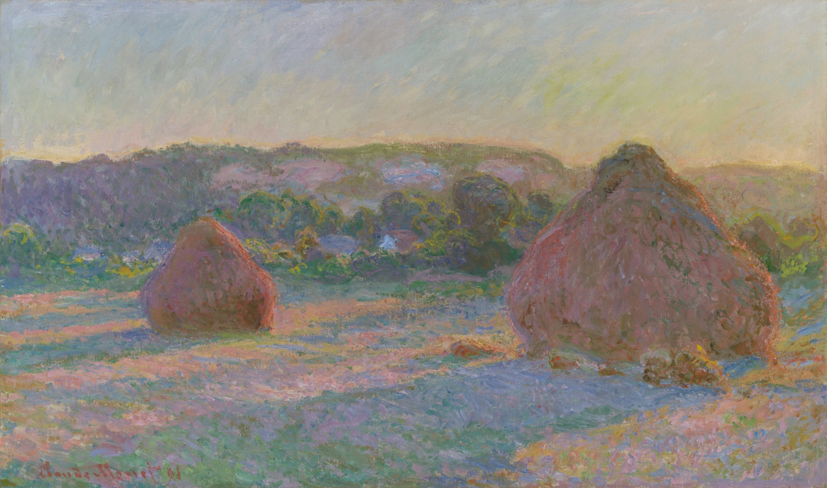
- Blend a warm and a cool directly and you get gray. Blend two warms and it stays alive.
- Pick one temperature to dominate the piece, and let the other one be the accent that earns its place.
Get the values right in gray and the color almost paints itself.Kai Underwood
ColorCraftFundamentals
Liked this? The next one lands in your inbox.
Join the free Collective Dispatch. One focused email every other Tuesday.